GT-3 Cookbook: If in CMYK Color Mode
![]()
******** Color Matching is "Much Better"*********
|
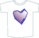
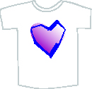
See the T-shirt images above. You will feel very sorry and ask yourself what's going on with your printer. This is not a printer's issue; it is a mis-translation between devices: color matching failure. In this case, the left artwork must be made in CMYK color mode, artwork is filled with Pantone colors; the right artwork must be made in RGB color mode with proper colors. Let's look at the details and avoid the trouble.
| ||||||||||||||||||||||||||||
|
To make a very complicated story short, color matching is a kind of "translation" amongst devices.
Imagine if all the attendees from various countries speak English, the conference will be understandable. But if two or three translators are necessary between two attendees, what will happen? Indirect "messages" imply ambiguity and vagueness. Maybe some mis-translation. The same trouble happens when the artwork is made in CMYK*.
| ||||||||||||||||||||||||||||
|
Example 1: RGB vs. CMYK Compare the process below when you want to fill an object in solid 100% yellow: it is very easy to see because your pure yellow might be printed with "dirty" dots. | ||||||||||||||||||||||||||||
| ||||||||||||||||||||||||||||
| ||||||||||||||||||||||||||||
|
This is just an example: of how the CMYK profile is different, the output color will be different, unexceptionally less color saturation and grayer. Needless to say, if the RGB is not sRGB, the same problem will occur. If you use Pantone® palette, the difference will be worse because of the application process. And it depends on applications to decide the "3" actions. Generally Microsoft Windows-oriented applications have less trouble, because they only accept RGB color mode (or color space). But high end graphic applications like Adobe Illustrator have a history of CMYK, and PostScript. Those who can make beautiful graphics sometimes have more trouble. Please use the proper color settings (refer to Photoshop, Illustrator, CorelDRAW X5 and CorelDRAW X4 and the former pages) so that you can get the best performance from GT-3. Remember, remarkably worst-effected colors are Yellow, Black, and Purple: if your artwork is grayish and dull colored, or you cannot get colors that look like Color Chart, maybe the color settings are wrong. |

 Home Home |
Copyright©2012 Brother Industries, Ltd. All Rights Reserved.