Fun with Fonts on THE Dream Machine
If you remember the days when a fancy electric typewriter had, maybe two fonts to choose from, you will be as dazzled by the number of fonts now available to us for machine embroidery. Software from Brother like BES 4
and PE-DESIGN
can even convert a computer's word processing fonts to stitch data, expanding the choices to something approaching unlimited. Sometimes I'd rather work simply, right on the machine's screen, and THE Dream Machine
has plenty of fonts and accompanying tools to accomplish an array (pun intended, as you'll see) of lettering. To begin, take a look at the font screen of THE Dream Machine.
With the machine in Embroidery mode, touch the second tab along the right edge of the screen to reveal the Alphabet Characters (You may have noticed that the third tab also sports letters; those are the Floral Alphabet Characters… although not all feature flowers.). Each icon on the displayed page features a different font; there's also a second page that you can access by moving the slider on the right.
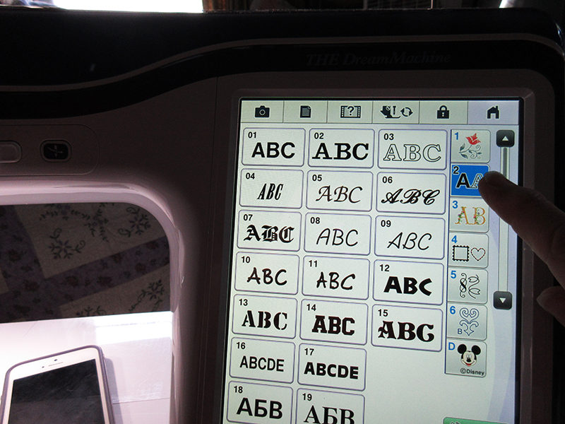
Making a Monogram
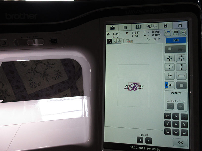
For our first foray into fonts, let's create a traditional three-letter monogram, with a larger letter (representing the surname) in the middle. My initials are RKB, so I'll use those for the example; the B will wind up in the middle. I'm going to pick an ornate, curvy font, number 06, then type in my initials in their altered sequence: RBK. 1. Type R and then touch the L-M-S icon once to change its size to medium.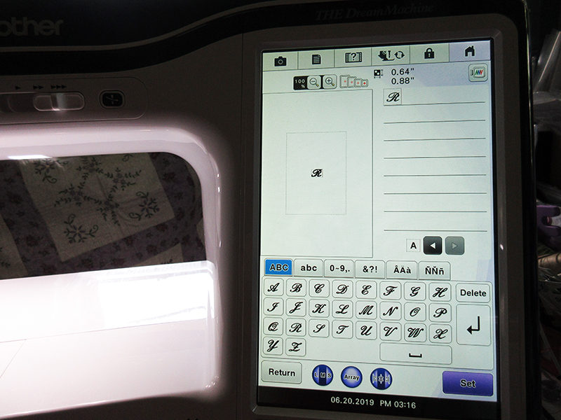 2. Type B and then touch the L-M-S icon twice to cycle back to large size. Notice that only the B changes size.
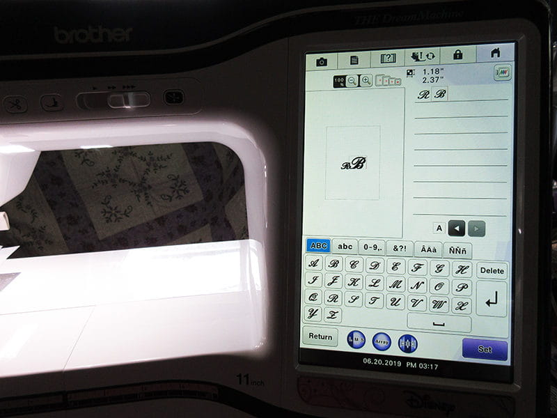 3. Type K and then touch the L-M-S icon once to change its size to medium. Touch Set.
4. Touch Edit and scroll to the second page of editing icons. Choose the icon for separating the text (the second one down on the right). Touch the Knife icon to separate the R and B. Touch the Knife icon again to divide the B and K. You'll have three separate design elements on screen that can be manipulated individually. Touch OK.
3. Type K and then touch the L-M-S icon once to change its size to medium. Touch Set.
4. Touch Edit and scroll to the second page of editing icons. Choose the icon for separating the text (the second one down on the right). Touch the Knife icon to separate the R and B. Touch the Knife icon again to divide the B and K. You'll have three separate design elements on screen that can be manipulated individually. Touch OK.
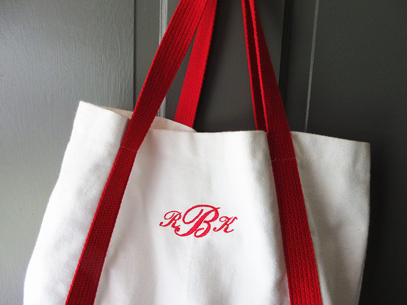
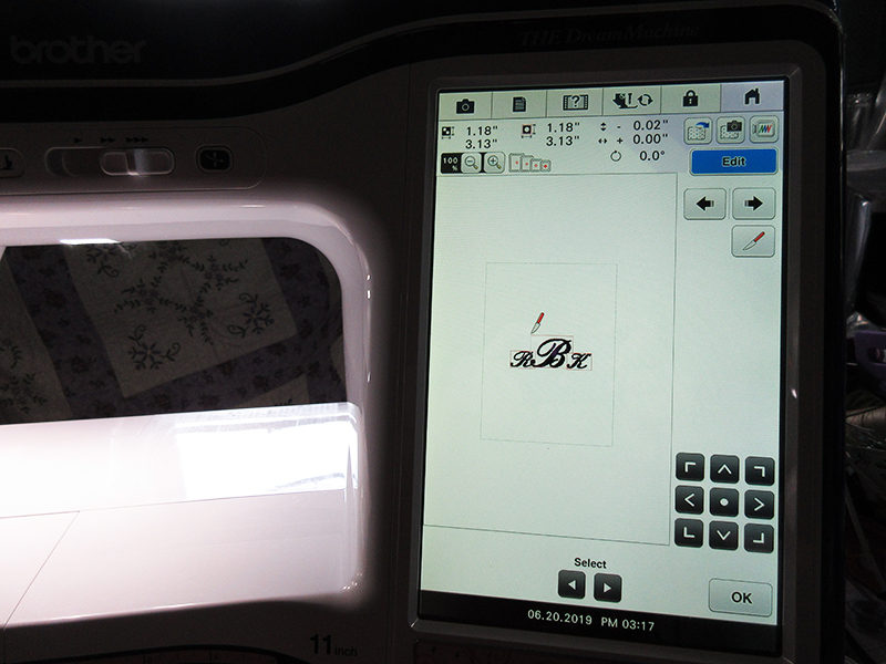 5. Use the Select arrows to choose the B. Move and resize the B as desired to accomplish a pleasing arrangement of letters. You may find it helpful to change each letter to a different thread color, so that you can easily see the flourishes on each character. When you like the arrangement, it's ready to stitch.
Tip: In some cases, THE Dream Machine
provides more than one avenue to accomplish an editing task. Some tools are available in either the first screen, where you're choosing letters, or in the Edit menu of the screen that appears after you touch Set. Experiment to become familiar with all of the available icons and choose the method that works best for you.
provides more than one avenue to accomplish an editing task. Some tools are available in either the first screen, where you're choosing letters, or in the Edit menu of the screen that appears after you touch Set. Experiment to become familiar with all of the available icons and choose the method that works best for you.
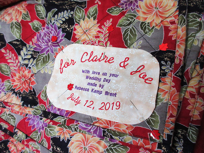
Stitching a Label
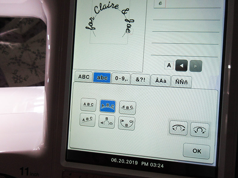
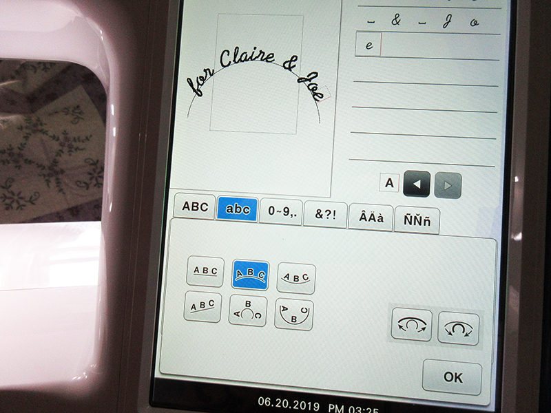
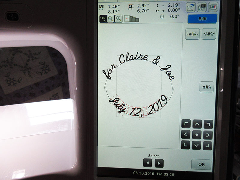
Our second lettering project is designed as a label for a quilt or other project, as a record of its maker and the motivation for making it. We can use a couple of different fonts to emphasize certain parts of the label and the Array function for variety in arranging the words. The same techniques can be used to make badges and patches or to stitch a longer block of text, such as a poem or recipe. 1. I'm using font 09 for the larger letters on my label; it's a free-and-easy font without heavy stitching. Type in the first line of text, "for Claire & Joe." Use both upper and lower-case letters for legibility, and access numbers and symbols from the tabs on the font selection screen.
Tip: The upward-facing bracket below the letters inserts a space between characters.
2. Touch the Array icon and choose the gentler upward arc (in the middle of the top row). Use the adjacent icons, with outward or inward arrows, to adjust the amount of arc. Touch OK and then Set. Move the line of text upward just to get it out of the way for the next text entry. Touch Add.
 3. Select font 09 again and enter the date. Touch Array and choose the gentle downward arc; change the arc's curvature as before. Touch Set and then Edit. Select Spacing and move the letters in the date closer together. Touch OK, move the line of text downward (out of the way), and touch Add.
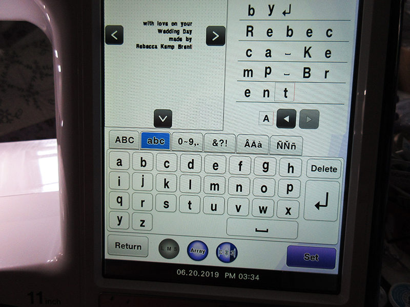
 4. Fonts 16 and 17 on THE Dream Machine are specially designed to be small, about 1/4" in height. We'll use them to add the block of text at the center of the label. As you choose your letters, you'll see that the L-M-S icon is not available for these special-purpose fonts. Be sure to proofread your entries in the panel to the right of the design area. I also like to zoom into the design area, using the icons just above it on screen; the maximum 200% zoom works well.
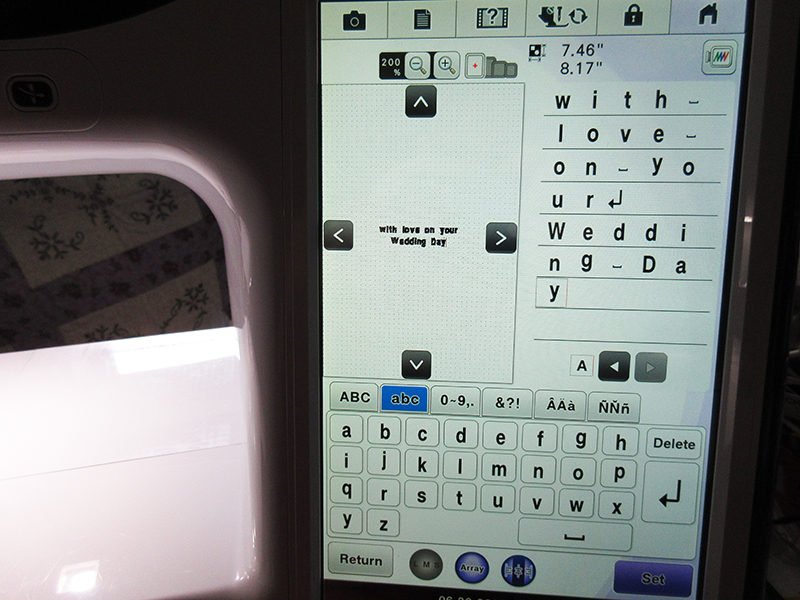 5. After each line in the text block, touch the Enter (left-angled arrow) icon. On some machines, it may be necessary to create each line as a separate element, but THE Dream Machine
adds this Enter function. That also allows a Justification icon, shown in the photo below, that will center the lines of text or shift them to right- or left-edge alignment.
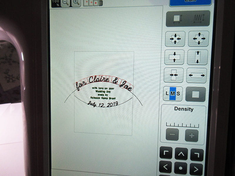
 6. Once all of the text is entered, touch Set, and use Edit to access the Size and Move commands. You can resize quickly with the L-M-S icon, or in smaller increments with the arrow icons. Arrange the upper and lower arcs and the block of text as you like. I decided to make the arched letters smaller so that my entire label fits into the 5" x 7" embroidery hoop. I also changed the color of the smallest text, to be sure there's a color stop that will remind me to switch to a finer thread (60- or 80-weight, or "micro") for the tiny letters.
 [caption id="attachment_20352" align="aligncenter" width="800"]
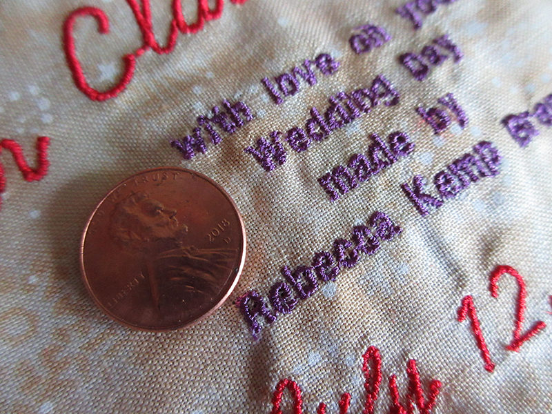 Notice the the open holes in the lowercase e's and a's.[/caption]
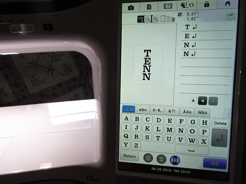
Vertical Letters
Here's one more technique for using the letters on THE Dream Machine:vertical lettering. If you like word art arrangements of words and phrases, or if you want to stitch a label for the spine of a notebook, this is the method you're looking for…and it's super simple.
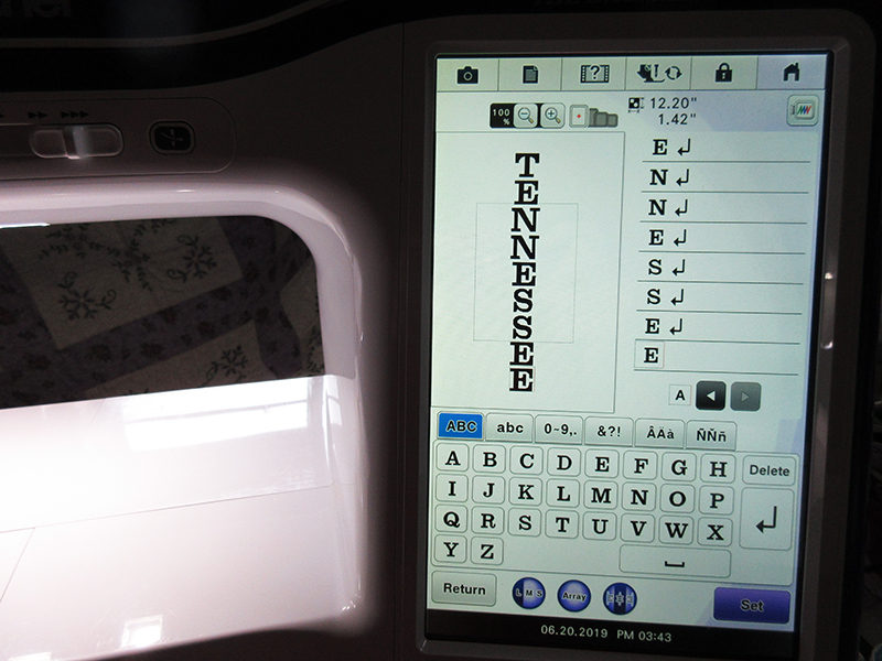 1. Pick your font; I'm using Font 02 in all caps, which is easier to read in this arrangement. Select your first letter and press Enter (the left-angled arrow icon).
2. Enter your second letter and touch Enter.
3. Repeat, pressing Enter after each letter.
1. Pick your font; I'm using Font 02 in all caps, which is easier to read in this arrangement. Select your first letter and press Enter (the left-angled arrow icon).
2. Enter your second letter and touch Enter.
3. Repeat, pressing Enter after each letter.
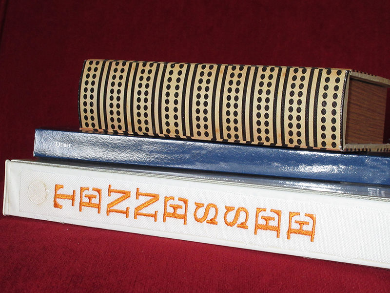 You can experiment with the Justification icon if you like, but centering each letter is the usual for columns of text.
These three exercises will get you started on lots of lettering adventures with THE Dream Machine.
You can experiment with the Justification icon if you like, but centering each letter is the usual for columns of text.
These three exercises will get you started on lots of lettering adventures with THE Dream Machine.As always, I encourage play: you can arrange and save lettering designs many times before choosing the one that's just right. Combining the techniques here opens even more possibilities…just imagine using those tiny letters in an arched array to create a merit badge or patch!
Related Projects
Stay Connected
* Required fields